
Summertime is the perfect time to experiment with a brand new color on your walls or in accessories. We’ve asked our Savvy design team to share some of their favorite haute hues. Here’s what they had to say.
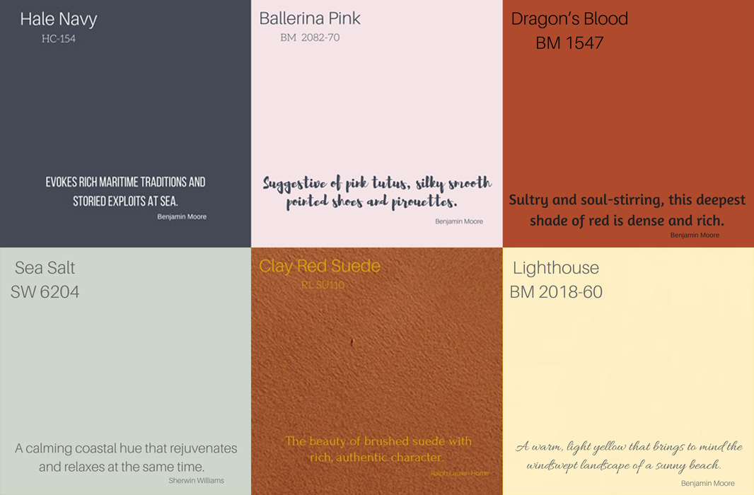
I’m not a fan of a pale baby blue or powder blue. I like a strong, rich blue.
Benjamin Moore’s ‘Hale Navy’ reminds me of the elegance of Europe. It can be a strong neutral to anchor a room when used on the ceiling. It can also bring a luxurious sense of privacy to a space. I love this sophisticated color on a beautifully detailed architectural wall in a study or dining room. And paired with a strong gold chandelier, it’s breathtaking!
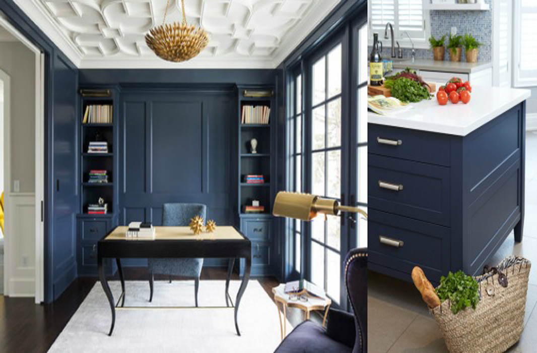
Image: Remodelholic
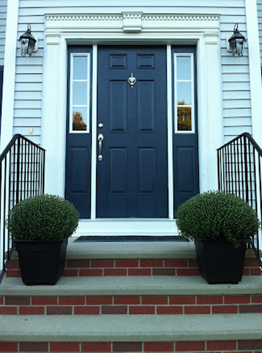
Image: House of Turquoise
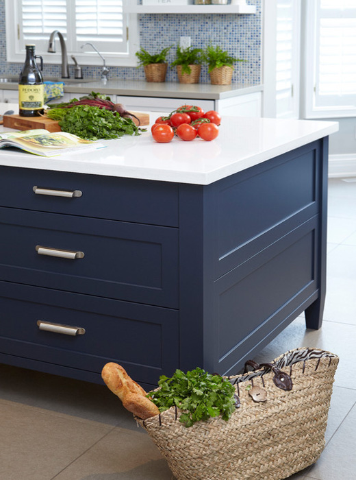
Image: House of Turquoise
I love ‘Ballerina Pink’ by Benjamin Moore. This soft, beautiful color is fresh and makes you want to take a deep breath and just relax. Not just for little girls’ rooms, this happy hue pairs well with sophisticated greys and crisp whites. It looks spectacular on a ceiling, above a white, beadboard wainscot, or dressing an entire room in pink loveliness.
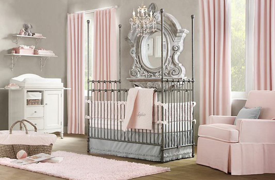
Image: Faburous
Image: Stylish Petite
Image: Apartment Therapy
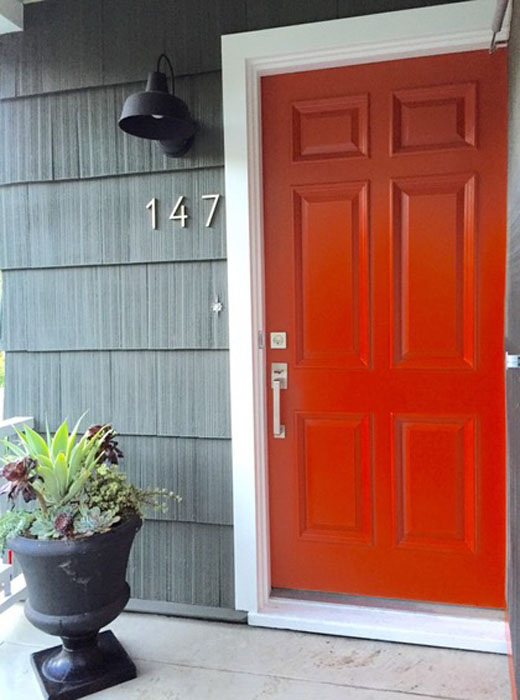
’Dragon’s Blood’ by Benjamin Moore is a unique, orange-red that adds the right pop of color without being overly bright. I would use it to dress the walls of a small space or as a dynamic accent wall. Then, I’d layer on a piece of artwork with blue hues for a cool-toned contrast.
Benjamin Moore – Dragon’s BLood
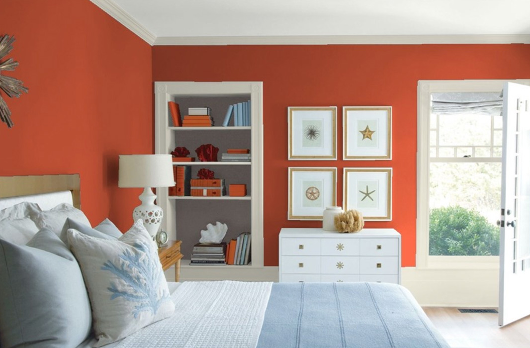
Benjamin Moore – Dragon’s Blood
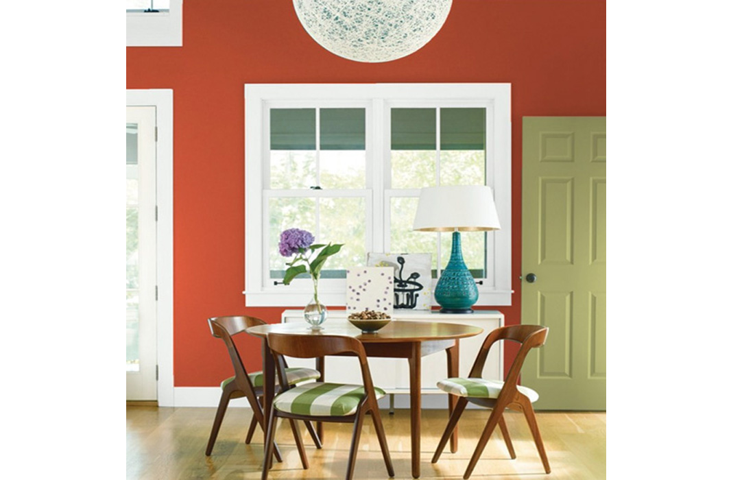
Benjamin Moore – Dragon’s Blood
My favorite green is ‘Sea Salt’ from Sherwin Williams. I love it because it is a “neutral” color with a tinge of green, but also has some blue undertones in alternate lighting. Sea Salt would be a beautiful hue in a bathroom or bedroom because it creates a very calm, spa-like environment. I’ve painted my bedroom walls this color for that exact reason, and I absolutely love it!” .
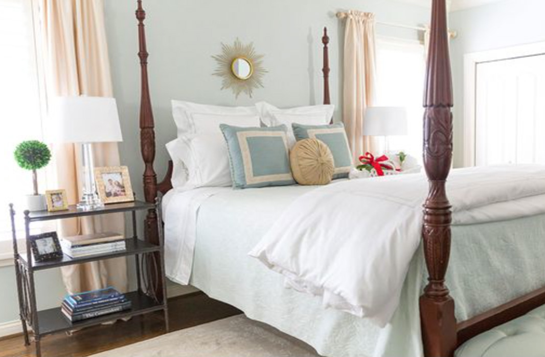
Image: Pizzazzerie
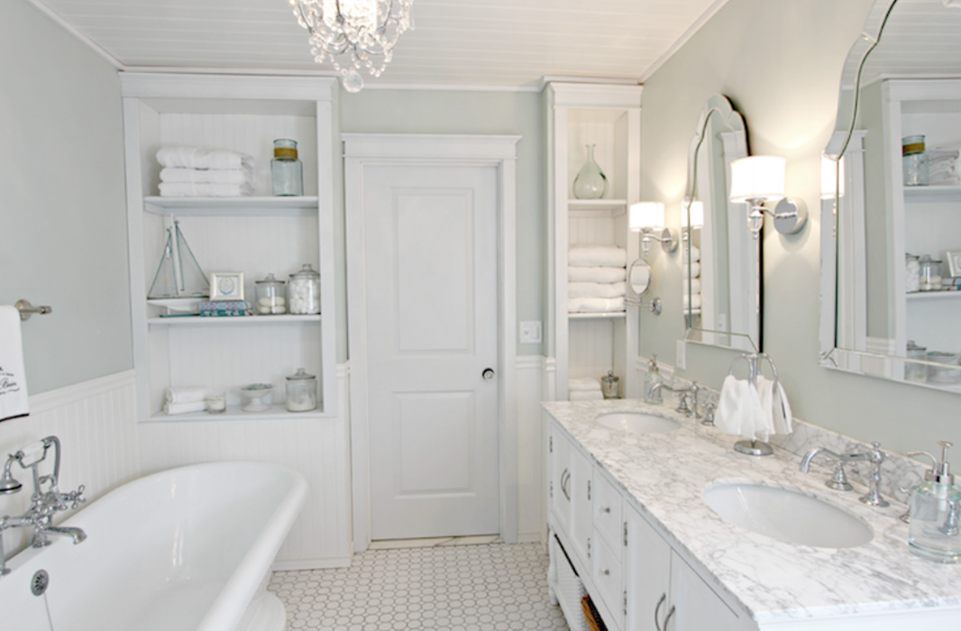
Image: DecorPad
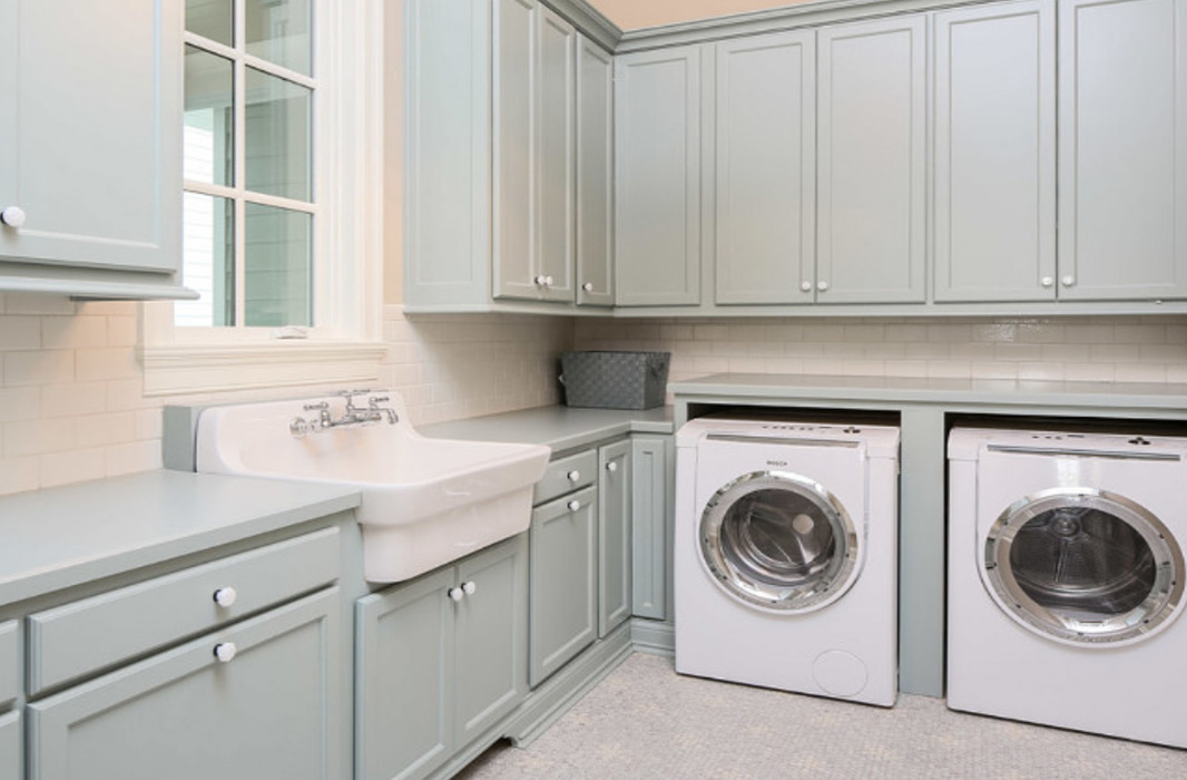
Image: Bell Custom Homes
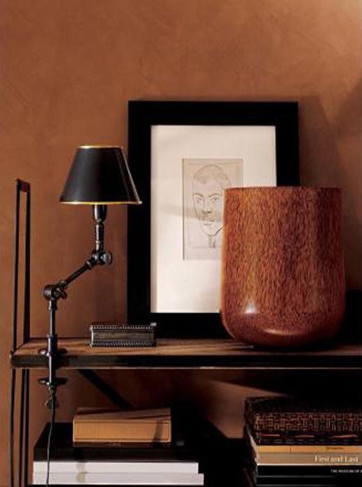
Image: Ralph Lauren Home
Ralph Lauren suede paints are so beautiful. I especially love Clay Red, which is similar to terra-cotta, very warm and rich. With undertones of brown, red, and orange, this wonderful hue reminds me of the sun setting on a hot summer night. Use this color on your walls for instant sophistication.
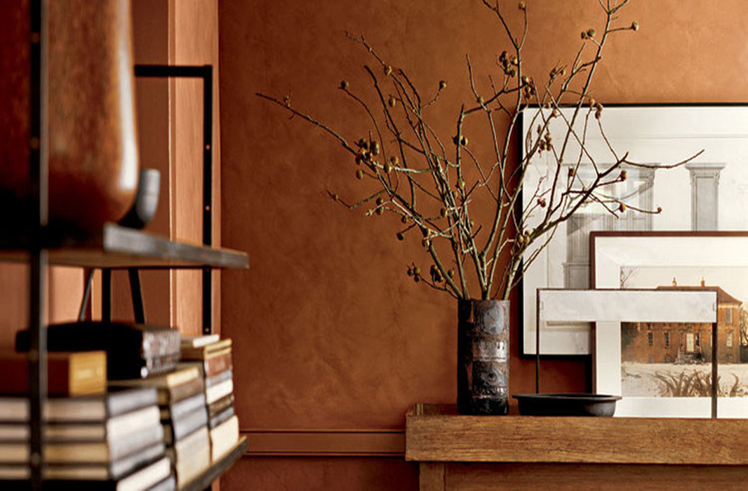
Image: Ralph Lauren Home
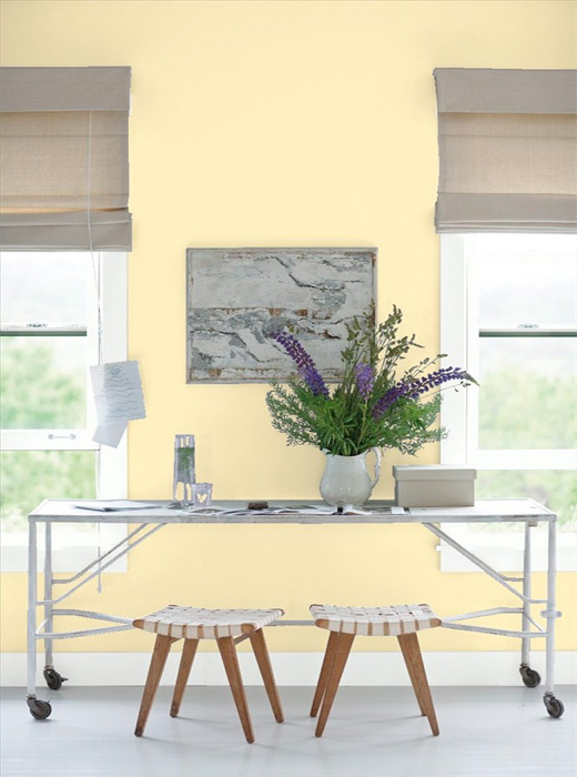
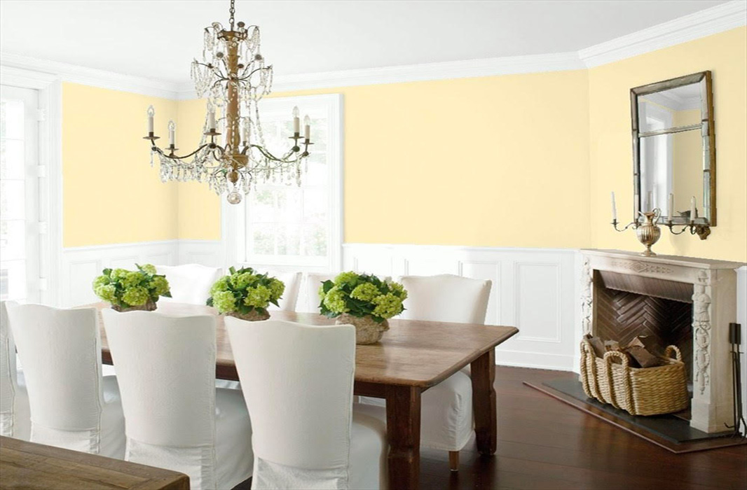
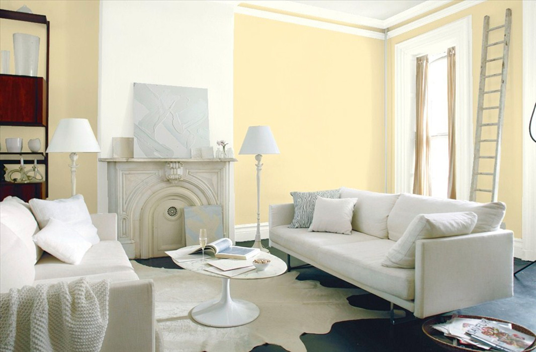
There’s nothing like Benjamin Moore’s ‘Lighthouse’ to add a bit of sunshine and cheerfulness to any room. Yellow, is not a color I often turn to, but this soft, yet saturated hue is classic and exudes warmth and whimsy. It can easily be used in both traditional and contemporary interiors. Paint the whole room or use it in accent pieces, such as pillows, vases and painted furniture.
Benjamin Moore – Lighthouse
Benjamin Moore – Lighthouse
Benjamin Moore – Lighthouse