
Love neutral walls?
Here are a few colors you might not have thought about!
Like a blank canvas for an artist, neutral walls can provide the foundation for a designer to be truly creative. What is interesting, though, is that more and more colors are being added to the “neutral” category. While we will always love white and beige, below are a few of our favorite neutral wall colors that are anything but boring.
Deep Blue
(We recommend Benjamin Moore ‘Newburyport Blue’ HC-155 or ‘Hudson Bay’ 1680)
Intended to recall the colors of the ocean, this blue is eye-catching, without being overbearing. A powerful, yet calming color, this shade works well as an artful background or to make a statement. Deep blues (including navy) feel warmer than black, but still provide great contrast. See how well it ties together this bathroom we recently completed?
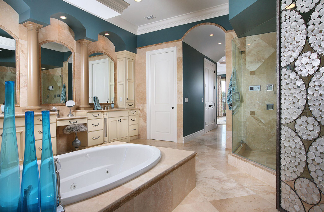
Image: Savvy Design
Time-tested Taupe
(We recommend Sherwin Williams ‘Mega Greige’ 7031 or
Benjamin Moore Meditation AF 395)
Although taupe has been a popular wall color for the past few years, we are seeing the range of taupe palettes extended this year—from light taupe to richer shades with deeper gray and chocolate undertones. This serene color brings a sense of sanctuary into our homes and offices. Taupe works well with mixed metals such as gold and copper. It is restorative and provides the perfect background for pops of colors (like these red chairs from one our favorite kitchen projects).
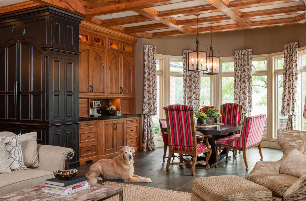
Image: Mike Cassimatis Photography
Mineral Gray
(We recommend Sherwin Williams ‘Cyberspace’ 7076, ‘Anonymous’ 7046 or ‘Grizzle Gray’ 7068)
Gray has been the new black for a while, but recently a darker hue has gained traction in the neutral category. Texture on the walls or ceiling accents can soften the color and it often works best with a minimalist style or color palette. Comforting and bold, the designers at Savvy are loving this color for 2017.
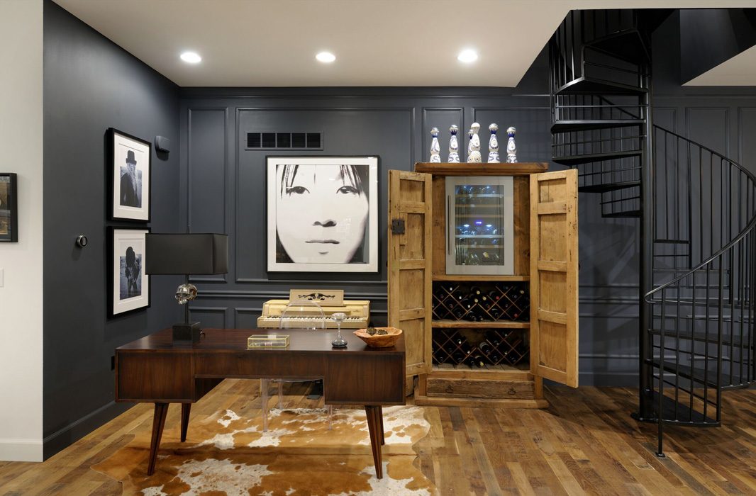
Image: Michael Jacob Photography
Urban Gray
(We recommend Sherwin Williams ‘Agreeable Gray’ 7029)
Not ready to kick it up to mineral gray? Try urban gray—a warmer variety that mirrors cement and evokes new starts and clean slates. A paler shade, this color creates a perfect backdrop to bold colors (like the beautiful blue rug below). This is a great hue to showcase a colorful sofa or statement art piece.
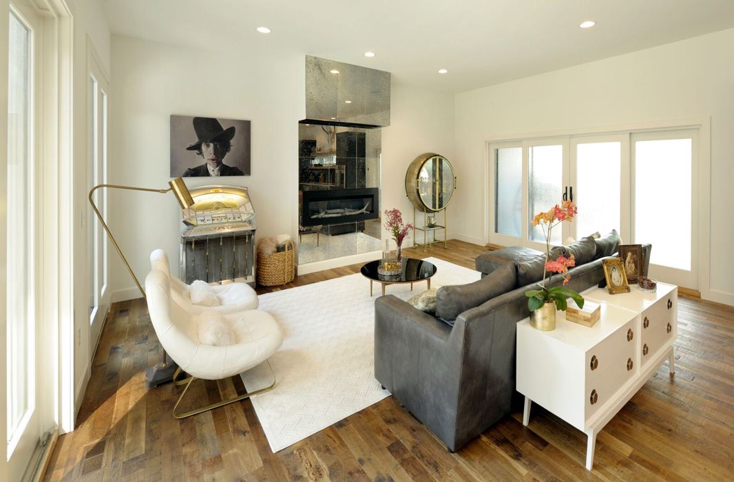
Image: Michael Jacob Photography
Like what you see? Interested in how these colors might look in your residential or commercial space? Contact us, Savvy Surrounding Style, for a free design consultation today!