
Love stripes with your checks? Fancy a few florals with your paisleys? Dig dots with your chevrons? But afraid that mixing more than two of your favs might end up in a match made in . . . well not heaven? Mixing patterns isn’t all that difficult and certainly not something to fear. Here’s some savvy advice from our design team that will give you the confidence to choose what you love and live with it beautifully. After all, two’s company, but three is definitely a party!
Remember the Magic Number
In design, groupings most always look best in odd numbers. Three is a good place to start when it comes to mixing patterns in a room, and if you’re really feeling brave, go ahead and add in a few more. Life’s short. Be daring. Just keep the number odd.
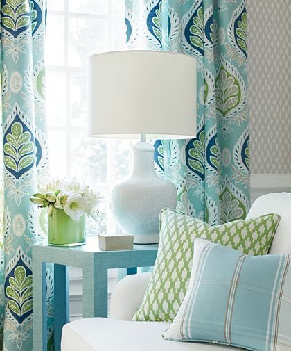
Image: Thibaut Design
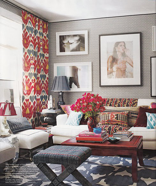
Image: Amber Interiors
Color is Key
Be sure to choose one common color to unify the patterns you use, creating a harmonious space. And stick with the same color intensity. For example, if you’re inspiration color is soft pink, it’s best to not introduce a spicy orange to the mix. Pastels play nicely with pastels. Jewel tones kick it up with jewel tones. You get the idea.
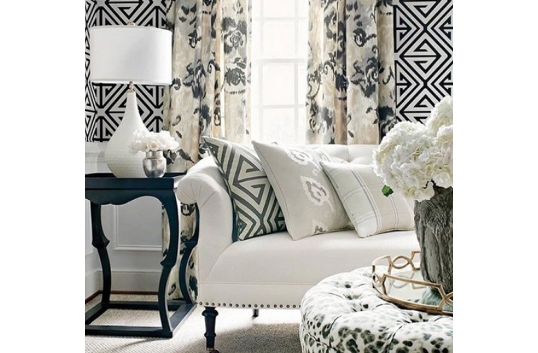
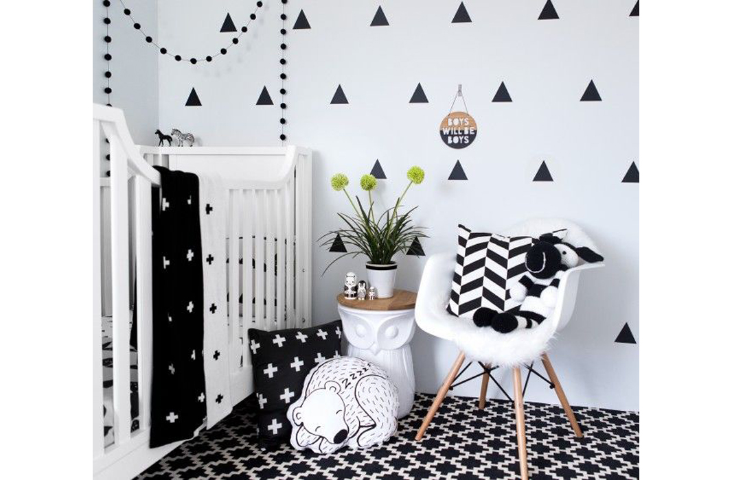
Black and White Is Always Right
Opting to add a black and white geometric pattern into a colorful palette helps to neutralize the boldness of pattern mixing. Sticking with a black and white only palette is also fresh, interesting, and always on point.
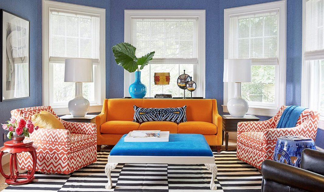
Image: One Kings Lane
Designer: Patrick Mele
Images: Pinterest
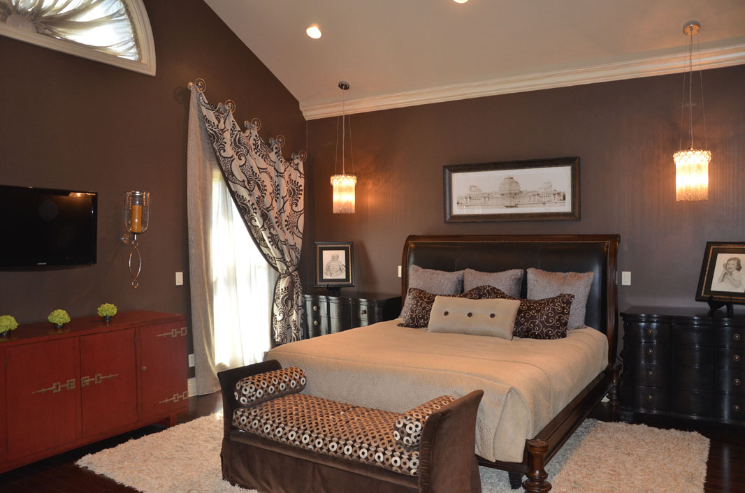
Don’t Tip the Scale
Varying the scale of patterns keeps things interesting and ensures that the different patterns don’t compete with each other. Again, the rule of three comes to mind. Try choosing one large, one medium and one small pattern to create a cohesive visual whole. And remember, balance patterns around the room, too, so the space doesn’t have a top heavy feeling.
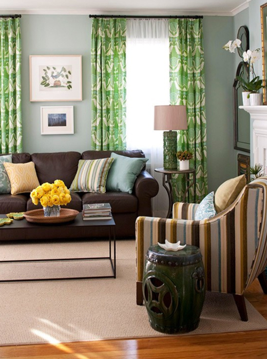
Image: Better Homes & Gardens
Size Matters
It’s important to think about where the patterns will be used. For example, small prints can look very busy on a large wall or carpet. Keep bigger prints on bigger spaces and medium to small prints on furniture, pillows or accessories. It’s really all just a balancing act. For example, in this dining room, an oversized swirl and trellis pattern in a soft robin’s egg blue on the wallcovering sets the tone, while a medium-sized floral adds interest to the chair’s back cushions. The smaller, bright gold geometric on the chair’s front seats and backs complete this happy dance of patterns.
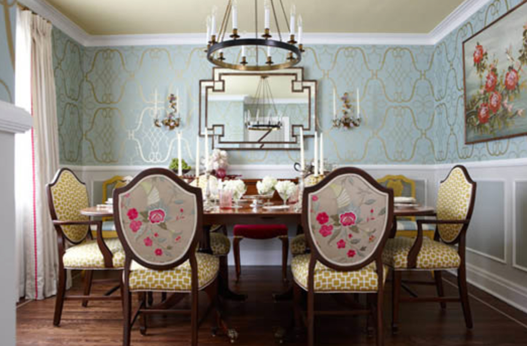
Image: HGTV
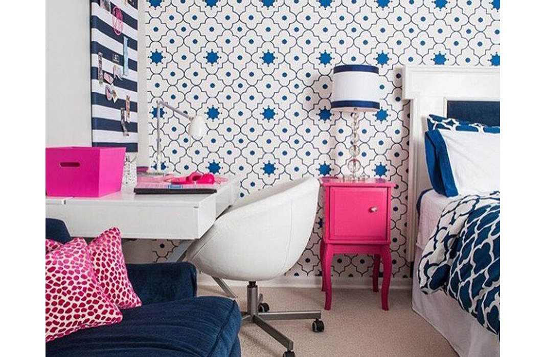
Image: Jasmin Reese Interiors
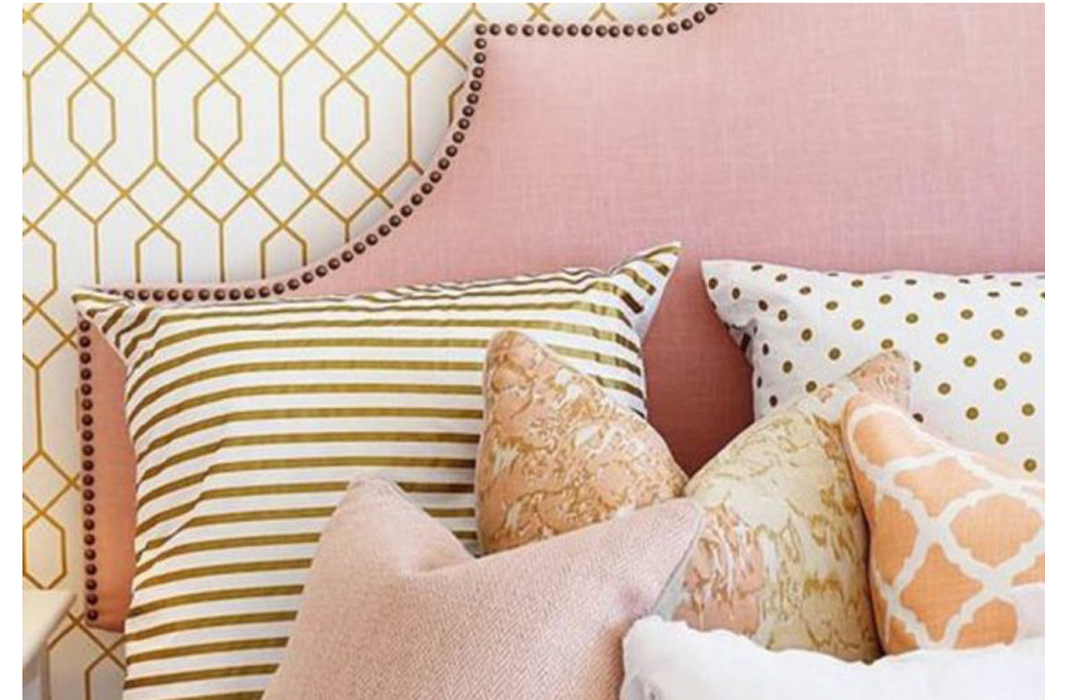
Image: nousDECOR
Ground the Look
Adding a solid to the mix gives the eye a place to rest and can accentuate the patterns that are there and help to balance the space.
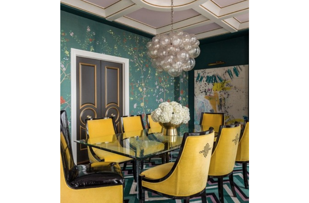
Image: Best of Interiors
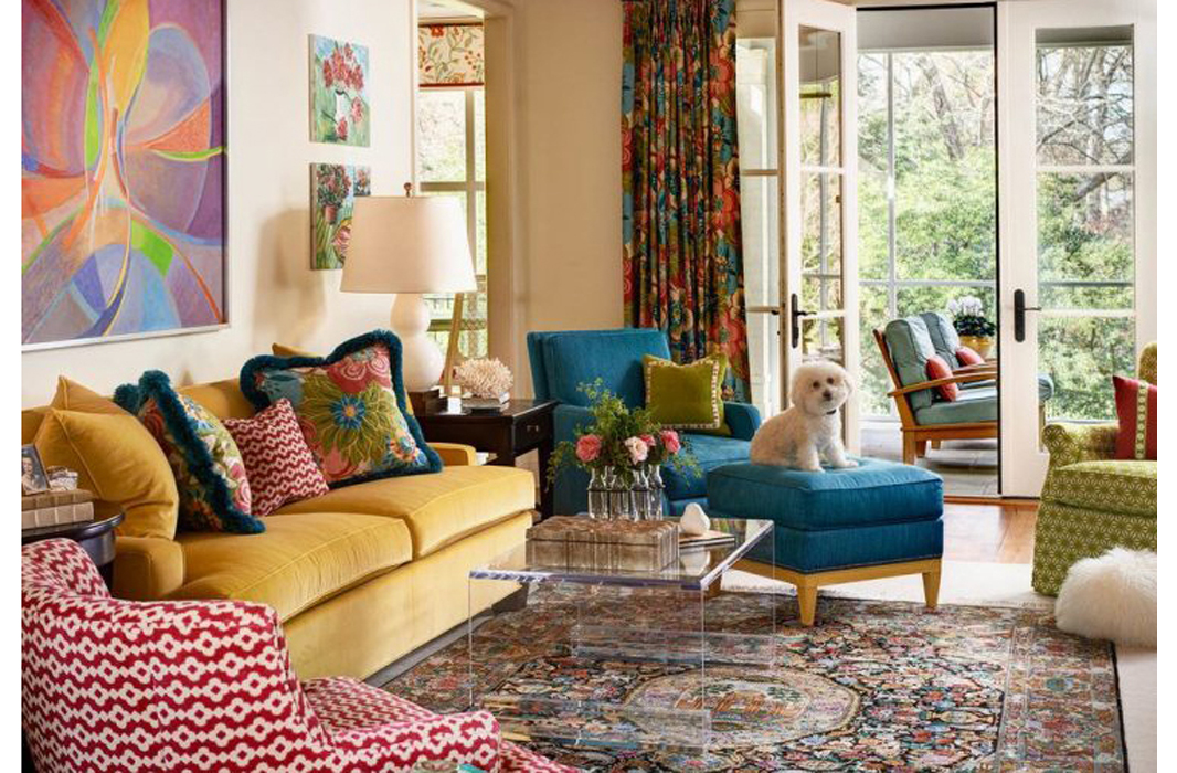
Image: Billie Lourde
Beauty is in the Eye of the Beholder
As always with design, beauty truly is in the eye of the beholder, so do what works for you. If you love it, then it’s always right.